Matplotlib
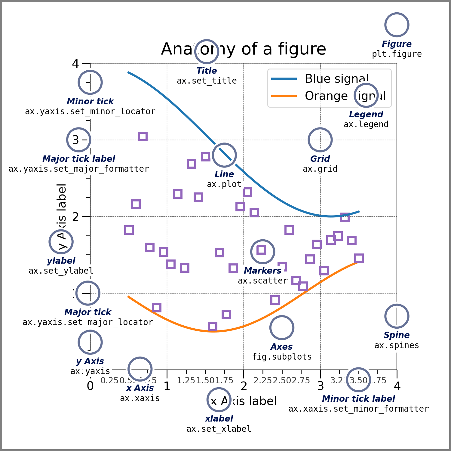
图的组成部分
创建简单图
隐式创建: plt.plot()
参数说明
import matplotlib.pyplot as plt

plt.plot(x, y,
        fmt='',          # 格式字符串(颜色、线型、标记)
        label='',        # 图例标签
        linewidth=2,     # 线宽
        linestyle='-',   # 线型(实线、虚线等)
        color='blue',    # 颜色
        marker='o',      # 标记样式
        markersize=8,    # 标记大小
        alpha=1.0,      # 透明度(0~1)
        ...)
plt.show()
示例
# 单线统计图
import matplotlib.pyplot as plt
plt.plot([1,2,3,4,5],[1,4,9,16,25])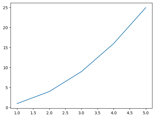
# 多线统计图
import matplotlib.pyplot as plt
plt.plot([1,2,3,4,5],[1,4,9,16,25],'b-.',[2,3,5,6,10],[1,4,6,2,14],'r--')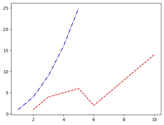
显式创建 : fig,ax = plt.subplots()
plt.subplots()同时创建一个 图形窗口(Figure) 和 一个或多个坐标轴(Axes)返回值:
fig:顶级容器(Figure 对象),代表整个图形窗口。ax:坐标轴(Axes 对象)或坐标轴数组,用于绘制具体图表(如折线、柱状图等)
示例
import matplotlib.pyplot as plt
fig, ax = plt.subplots()

# 在ax上绘图(等效于plt.plot())
ax.plot([1, 2, 3], [4, 5, 6])
ax.set_xlabel("X Label")  # 设置x轴标签
ax.set_ylabel("Y Label")  # 设置y轴标签
plt.show()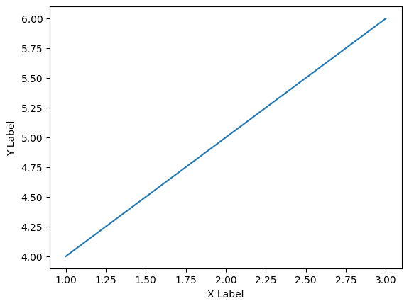
# 创建2行2列的子图网格(共4个坐标轴)
fig, axes = plt.subplots(nrows=2, ncols=2)

# 在第一个子图(左上角)绘图
axes[0, 0].plot([1, 2, 3], [4, 5, 6])
axes[0, 0].set_title("Subplot 1")

# 在第四个子图(右下角)绘图
axes[1, 1].scatter([1, 2, 3], [4, 5, 6])
plt.tight_layout()  # 自动调整子图间距
plt.show()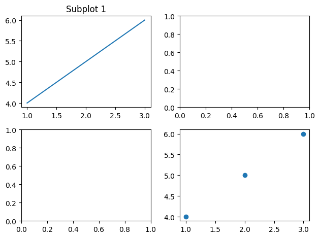
基本统计图示例
散点图
import matplotlib.pyplot as plt
import numpy as np

x = np.random.uniform(0,1,100)
y = np.random.uniform(0,1,100)

fig, ax = plt.subplots()
ax.scatter(x, y)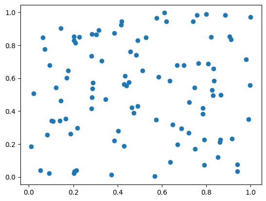
条形图
import matplotlib.pyplot as plt
import numpy as np

x = np.arange(10)
y = np.random.uniform(1,10,10)

fig, ax = plt.subplots()
ax.bar(x, y)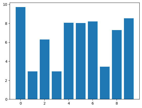
矩阵热图
import matplotlib.pyplot as plt
import numpy as np

z = np.random.uniform(0,1,(20,20))

fig, ax = plt.subplots()
ax.imshow(z)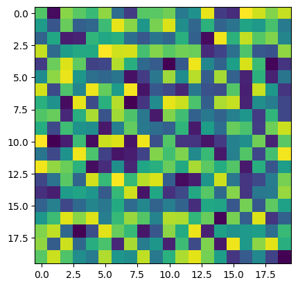
填充等高线图
import matplotlib.pyplot as plt
import numpy as np

z = np.random.uniform(0,1,(20,20))

fig, ax = plt.subplots()
ax.contourf(z)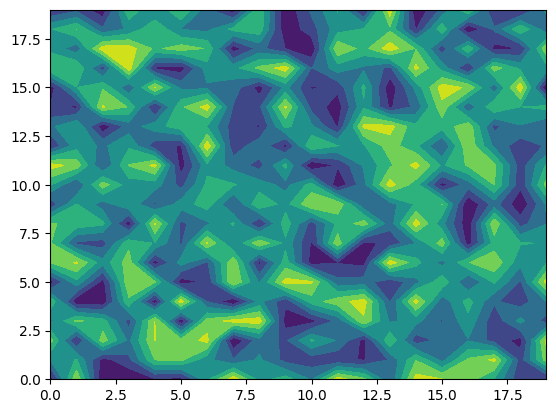
饼图
import matplotlib.pyplot as plt
import numpy as np

z = np.random.uniform(0,1,4)

fig, ax = plt.subplots()
ax.pie(z)
直方图
import matplotlib.pyplot as plt
import numpy as np

z = np.random.uniform(0,1,100)

fig, ax = plt.subplots()
ax.hist(z)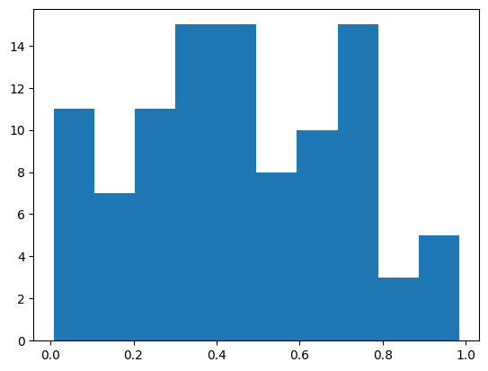
误差棒图
import matplotlib.pyplot as plt
import numpy as np

x = np.arange(5)
y = np.random.uniform(0,1,5)

fig, ax = plt.subplots()
ax.errorbar(x, y, y/4)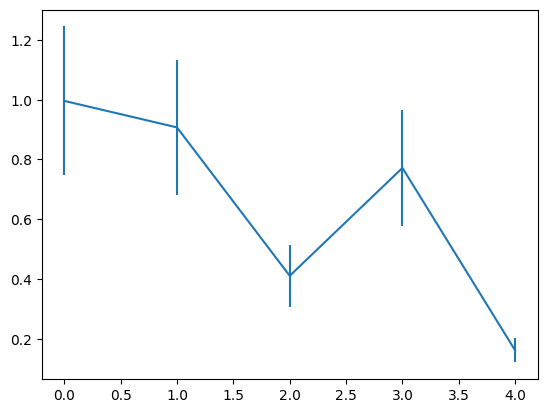
盒图
import matplotlib.pyplot as plt
import numpy as np

x = np.random.uniform(0,1,(100,3))

fig, ax = plt.subplots()
ax.boxplot(x)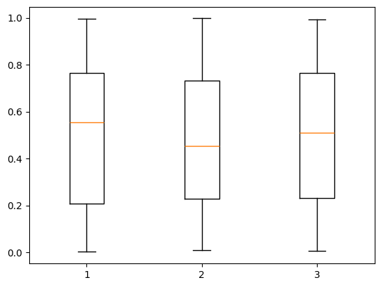
统计图整体配置
图形属性
fig = plt.figure(figsize=(10, 6), dpi=100, facecolor='lightgray', edgecolor='black')figsize: 图形大小dpi: 分辨率facecolor: 背景色edgecolor: 边框颜色
标题与标签
ax.set_title('Title', fontdict={'fontsize':14, 'color':'red'}) # 设置标题
ax.set_xlabel('X Label', labelpad=15)  # labelpad控制标签与轴的距离
图例配置
fig, ax = plt.subplots()

x = np.arange(10)
for i in range(1, 5):
    ax.plot(x, i*x**2, label='Group %d'%i)

# 设置图例
ax.legend(loc='upper right', fontsize=10,
          title='Legend', title_fontsize=12,
          frameon=True, shadow=True,
          facecolor='white', edgecolor='black',
          framealpha=0.8, ncol=2)  # frameon:是否显示图例框, framealpha:图例框透明度, ncol:分列显示
# 将图例放在统计图外
# ax.legend(bbox_to_anchor=(1.05, 1), loc='upper left')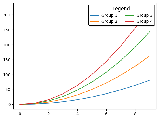
网格线配置
ax.grid(True)  # 显示网格
ax.grid(axis='y', linestyle='--', alpha=0.5)  # 仅显示y轴网格线
ax.grid(which='minor', linestyle=':', linewidth=0.5)  # 次刻度网格
标注系统
基本标注
fig, ax = plt.subplots()
x = [1, 2, 3, 4]
y = [1, 4, 2, 3]

# 添加x轴、y轴的轴标签
ax.set_xlabel('xlabel', fontsize=10, color='g')
ax.set_ylabel('ylabel', fontsize=10, color='g')

# 打开网格
plt.grid(True)

# 添加文本标注
ax.text(2, 3, 'Important Point', style='italic',
        bbox={'facecolor':'red', 'alpha': 0.5, 'pad':10})

# 添加箭头标注
ax.annotate('Peak Value', xy=(2, 4), xytext=(3, 4.5),
           arrowprops=dict(facecolor='black', shrink=0.05))

ax.plot(x,y)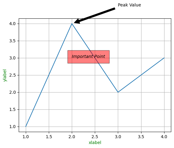
高级标注选项
fig, ax = plt.subplots()
x = [1, 2, 3, 4]
y = [1, 4, 2, 3]

ax.annotate('Critical Point', xy=(3, 2), xycoords='data',
            xytext=(0.8, 0.95), textcoords='axes fraction',
            arrowprops=dict(arrowstyle="->",
                            connectionstyle="angle3,angleA=0,angleB=-90"),
            bbox=dict(boxstyle="round", fc="w"))

plt.grid(True)
ax.plot(x,y)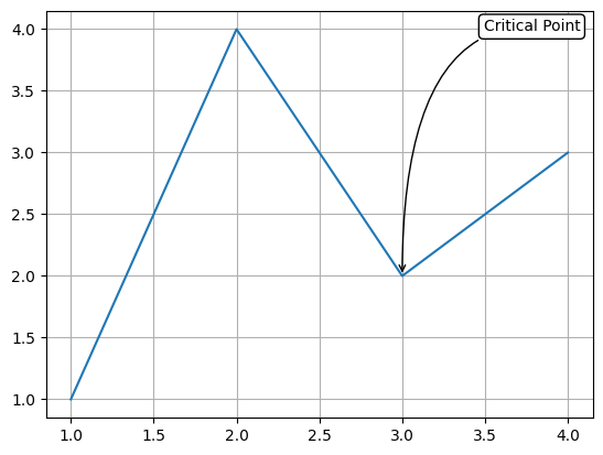
连接线标注
import matplotlib.pyplot as plt
from matplotlib.patches import ConnectionPatch
import numpy as np

# 生成示例数据
x = np.linspace(0, 10, 100)
y1 = np.sin(x)
y2 = np.cos(x)

# 创建图形和子图
fig, (ax1, ax2) = plt.subplots(1, 2, figsize=(12, 5))
fig.subplots_adjust(wspace=0.3) # ws:调整子图间距

# 绘制子图1(正弦曲线)
ax1.plot(x, y1, color='royalblue', lw=2)  # lw:线宽
ax1.set_title('Sin(x)', fontsize=12)
ax1.axhline(0, color='gray', linestyle='--', alpha=0.5) # 添加水平参考线,灰色虚线,透明度0.5

# 绘制子图2(余弦曲线)
ax2.plot(x, y2, color='crimson', lw=2)
ax2.set_title('Cos(x)', fontsize=12)
ax2.axhline(0, color='gray', linestyle='--', alpha=0.5) # 添加水平参考线,灰色虚线,透明度0.5

# 标记要连接的点(π/2处)
point_x = np.pi / 2
sin_y = np.sin(point_x)
cos_y = np.cos(point_x)

# 在子图中标记点(样式增强)
ax1.scatter(point_x, sin_y, color='red', s=80, zorder=5,
            edgecolor='black', linewidth=1, label=f'sin(π/2)={sin_y:.2f}')  # s:点的大小, zorder:图层顺序, linewidth:边缘线的宽度
ax2.scatter(point_x, cos_y, color='blue', s=80, zorder=5,
            edgecolor='black', linewidth=1, label=f'cos(π/2)={cos_y:.2f}')  # s:点的大小, zorder:图层顺序, linewidth:边缘线的宽度

# 在子图中标记点(样式增强)
ax1.scatter(point_x, sin_y, color='red', s=50, zorder=5,
            edgecolor='black', linewidth=1, label=f'sin(π/2)={sin_y:.3f}')
ax2.scatter(point_x, cos_y, color='blue', s=50, zorder=5,
            edgecolor='black', linewidth=1, label=f'cos(π/2)={cos_y:.3f}')

# 创建曲线连接线(关键修改)
con = ConnectionPatch(
    xyA=(point_x, sin_y),  # 起点
    xyB=(point_x, cos_y),  # 终点
    coordsA="data",
    coordsB="data",
    axesA=ax1,
    axesB=ax2,
    arrowstyle="->",
    color="green",
    linewidth=2,
    linestyle="dashed",
    mutation_scale=20,
    # 曲线样式参数(核心修改)
    connectionstyle="arc3,rad=0.3",  # rad控制弧度大小(可正可负)
    shrinkA=5,  # 起点缩进
    shrinkB=5   # 终点缩进
)
fig.add_artist(con)

# 添加图例(替代文本标注)
ax1.legend(loc='upper right', framealpha=0.6)
ax2.legend(loc='upper right', framealpha=0.6)

# 调整刻度显示
for ax in [ax1, ax2]:
    ax.set_xticks([0, np.pi/3, 2*np.pi/3, np.pi, 4*np.pi/3, 5*np.pi/3, 2*np.pi])
    ax.set_xticklabels(['0', 'π/3', '2π/3', 'π', '4π/3', '5π/3', '2π'], fontsize=10)
    ax.set_xlim(left=0, right=2*np.pi)  # 设置x轴范围
    ax.grid(True, linestyle=':', alpha=0.5)

# 全局标题
fig.suptitle('Trigonometric Functions with Curved Connection',
             fontsize=14, y=1.05, weight='bold')

fig.tight_layout()  # 自动调整子图参数(间距、边距),防止标签/标题重叠
plt.show()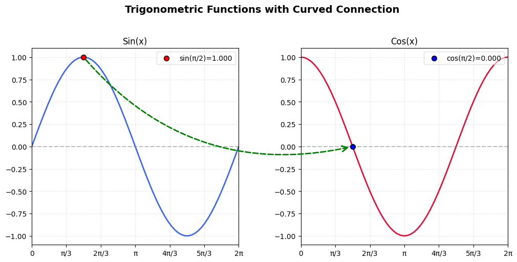
线条自定义
线条粗细
- plt.plot() 的 linewidth 属性可以定义线条的粗细
x = [1,2,3,4,5]
y = [1,4,9,16,25]

fig,ax = plt.subplots()
ax.plot(x,y,linewidth=3.0)

plt.xlabel('xxx',fontsize=16)
plt.ylabel('yyy',fontsize=16)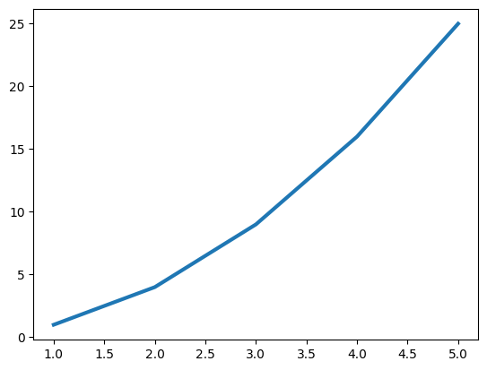
线条样式
| 字符 | 类型 | 字符 | 类型 |
|---|---|---|---|
'-' | 实线 | '--' | 虚线 |
'-.' | 虚点线 | ':' | 点线 |
'.' | 点 | ',' | 像素点 |
'o' | 圆点 | 'v' | 下三角点 |
'^' | 上三角点 | '<' | 左三角点 |
'>' | 右三角点 | '1' | 下三叉点 |
'2' | 上三叉点 | '3' | 左三叉点 |
'4' | 右三叉点 | 's' | 正方点 |
'p' | 五角点 | '*' | 星形点 |
'h' | 六边形点1 | 'H' | 六边形点2 |
'+' | 加号点 | 'x' | 乘号点 |
'D' | 实心菱形点 | 'd' | 瘦菱形点 |
'_' | 横线点 |
x = [1,2,3,4,5]
y = [1,4,9,16,25]

fig,ax = plt.subplots()
ax.plot(x, y,':') # 设置线条样式为点线

plt.xlabel('xxx',fontsize=16)
plt.ylabel('yyy',fontsize=16)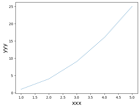
线条颜色
| 字符 | 颜色 |
|---|---|
b | 蓝色, blue |
g | 绿色, green |
r | 红色, red |
c | 青色, cyan |
m | 品红, magenta |
y | 黄色, yellow |
k | 黑色, black |
w | 白色, white |
x = [1,2,3,4,5]
y = [1,4,9,16,25]

fig,ax = plt.subplots()
ax.plot(x, y, color='r')

plt.xlabel('xxx',fontsize=16)
plt.ylabel('yyy',fontsize=16)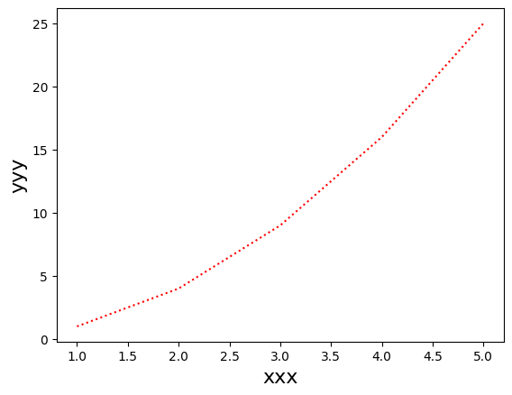
坐标点样式
x = [1,2,3,4,5]
y = [1,4,9,16,25]

fig,ax = plt.subplots()
ax.plot(x, y, marker='o')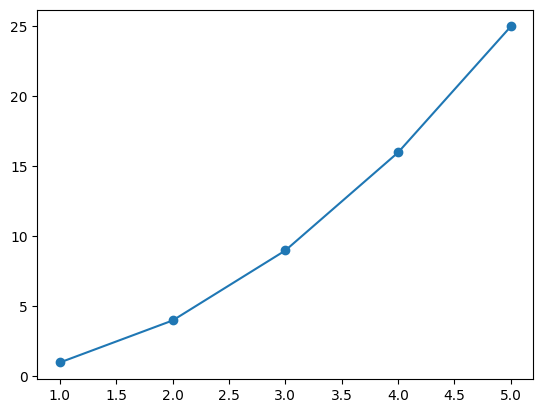
同时设置样式+颜色
plt.plot([1,2,3,4,5],[1,4,9,16,25],'r--')
批量套用样式
plt.setp()可以为plt.plot()对象批量套用样式line = plt.plot([1,2,3,4,5],[1,4,9,16,25]) plt.setp(line, color='r', linewidth=2.0, alpha=0.3)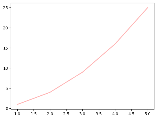
轴自定义
基本轴配置
轴范围设置
ax.set_xlim(left, right)  # 设置x轴范围
ax.set_ylim(bottom, top)  # 设置y轴范围
ax.axis([xmin, xmax, ymin, ymax])  # 同时设置x和y轴范围
ax.axis('equal')  # 等比例缩放x和y轴
ax.axis('auto')  # 自动调整轴范围
ax.axis('tight')  # 紧凑模式,去除多余空白
ax.axis('off')  # 关闭所有轴和边框
轴标签设置
ax.set_xlabel('X Label', fontsize=12, color='red')  # 设置x轴标签
ax.set_ylabel('Y Label', rotation=90)  # 设置y轴标签
ax.set_title('Title', fontsize=14, pad=20)  # 设置标题
刻度配置
刻度位置和标签
# 设置刻度位置和标签
ax.set_xticks([0, 1, 2, 3])  # 设置x轴刻度位置
ax.set_xticklabels(['A', 'B', 'C', 'D'])  # 设置x轴刻度标签

# 旋转刻度标签
ax.set_xticklabels(['A', 'B', 'C', 'D'], rotation=45) # 刻度标签旋转45°

# 标签与刻度对齐
ax.set_xticklabels(['A', 'B', 'C', 'D'], horizontalalignment='left')  # ['left', 'right'] 左对齐、右对齐

# 对数刻度
ax.set_xscale('log')  # 设置x轴为对数刻度
ax.set_yscale('linear')  # 设置y轴为线性刻度(默认)
刻度样式
# 刻度方向
ax.tick_params(axis='x', direction='in')  # 刻度线朝内
ax.tick_params(axis='y', direction='out')  # 刻度线朝外

# 刻度颜色和大小
ax.tick_params(axis='both', which='major', length=6, width=1.5,
               color='red', labelsize=10)

# 显示刻度
ax.tick_params(bottom='off', left='off')  # 关闭x轴、y轴刻度显示


# 主刻度和次刻度
from matplotlib.ticker import MultipleLocator
ax.xaxis.set_major_locator(MultipleLocator(1.0))  # 主刻度间隔1.0
ax.xaxis.set_minor_locator(MultipleLocator(0.5))  # 次刻度间隔0.5
坐标轴样式
坐标轴位置
ax.spines['left'].set_position(('data', 0))  # 将y轴移动到x=0处
ax.spines['bottom'].set_position(('data', 0))  # 将x轴移动到y=0处
ax.spines['right'].set_visible(False)  # 隐藏右侧轴
ax.spines['top'].set_visible(False)  # 隐藏顶部轴
坐标轴颜色和线宽
ax.spines['left'].set_color('blue')  # 设置左侧轴颜色
ax.spines['bottom'].set_linewidth(2)  # 设置底部轴线宽
双轴和次坐标轴
双Y轴
ax2 = ax.twinx()  # 创建共享x轴的双y轴
ax2.plot(x, y2, 'r-')  # 在第二个y轴上绘图
ax2.set_ylabel('Second Y')  # 设置第二个y轴标签
次坐标轴
from mpl_toolkits.axes_grid1.inset_locator import inset_axes
inset_ax = inset_axes(ax, width="30%", height="30%", loc=2)  # 创建内嵌轴
inset_ax.plot(x, y)
轴比例和投影
轴比例
ax.set_aspect('equal')  # 等比例轴
ax.set_aspect(2)  # y单位长度是x的2倍
极坐标投影
ax = plt.subplot(111, projection='polar')  # 极坐标轴
ax.plot(theta, r)
高级轴设置
共享轴
fig, (ax1, ax2) = plt.subplots(2, 1, sharex=True) # 共享x轴日期轴
import matplotlib.dates as mdates
ax.xaxis.set_major_formatter(mdates.DateFormatter('%Y-%m'))  # 日期格式
ax.xaxis.set_major_locator(mdates.MonthLocator())  # 按月设置刻度
自定义刻度格式
# 显示Y轴为百分比刻度
from matplotlib.ticker import FuncFormatter
def format_fn(tick_val, tick_pos):
    return f"{tick_val:.1f}%"
ax.yaxis.set_major_formatter(FuncFormatter(format_fn))

# 效果同上
from matplotlib.ticker import PercentFormatter
ax.yaxis.set_major_formatter(PercentFormatter(1.0))

# 效果同上
ax.set_yticklabels(['{:.0%}'.format(y) for y in ax.get_yticks()])
# 或使用f-string:
# ax.set_yticklabels([f'{y:.0%}' for y in ax.get_yticks()])
子图
创建子图
方法1: 使用
plt.subplots()(推荐)fig, axes = plt.subplots(nrows=2,ncols=2) # 创建2*2的子图网格 axes[0, 0].plot([1, 2, 3], [1, 2, 3]) # 在第一个子图上绘制
方法2: 使用
plt.subplot()plt.subplot(2, 2, 1) # 选择2行2列的第一个子图 plt.plot([3,4,5],[1,2,3]) plt.subplot(2, 2, 2) # 选择2行2列的第一个子图 plt.plot([3,4,5],[1,2,3],'r--') plt.subplot(2, 2, 3) # 选择2行2列的第一个子图 plt.plot([3,4,5],[1,2,3],'b-.')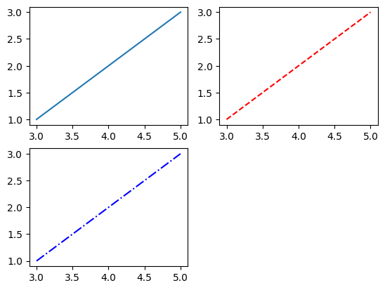
方法3: 使用
GridSpec创建更灵活布局import matplotlib.gridspec as gridspec # 创建2行2列4个子图,横向比例1:2,纵向比例4:1 gs = gridspec.GridSpec(2, 2, width_ratios=[1, 2], height_ratios=[4, 1]) ax1 = plt.subplot(gs[0]) ax2 = plt.subplot(gs[1]) ax3 = plt.subplot(gs[2]) ax4 = plt.subplot(gs[3])
子图布局调整
fig,axes = plt.subplots(2, 2)

# 调整子图间距
plt.subplots_adjust(wspace=0.5, hspace=0.3) # 宽度和高度间距

# 紧凑布局
plt.tight_layout() # 自动调整子图参数
# 共享坐标轴
fig, axes = plt.subplots(2, 2, sharex=True, sharey=True)
不规则子图布局
# 使用subplot2grid
ax1 = plt.subplot2grid((3, 3), (0, 0), colspan=3)
ax2 = plt.subplot2grid((3, 3), (1, 0), colspan=2)
ax3 = plt.subplot2grid((3, 3), (1, 2), rowspan=2)
ax4 = plt.subplot2grid((3, 3), (2, 0))
ax5 = plt.subplot2grid((3, 3), (2, 1))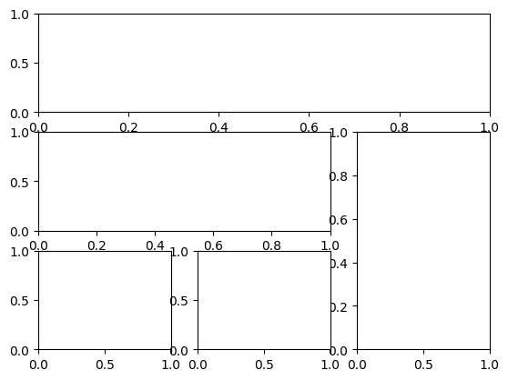
实用技巧
子图标题和标签
fig, axes = plt.subplots(2, 2)

# 设置子图标题
axes[0, 0].set_title('First Subplot')

# 设置全局标题
fig.suptitle('overall Figure Title', y=1.05)

# 设置坐标轴标签
axes[1, 1].set_xlabel('X Axis')
axes[1, 1].set_ylabel('Y Axis')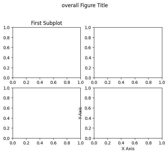
颜色条和子图
fig, (ax1, ax2) = plt.subplots(1, 2)

data = np.random.rand(10, 10)
im = ax1.imshow(data)
fig.colorbar(im, ax=ax1) # 只为第一个子图添加颜色条

# 或者为所有子图添加共享颜色条
fig.colorbar(im, ax=axes.ravel().tolist())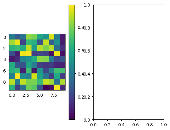
整体风格
# 查看可用的风格
plt.style.available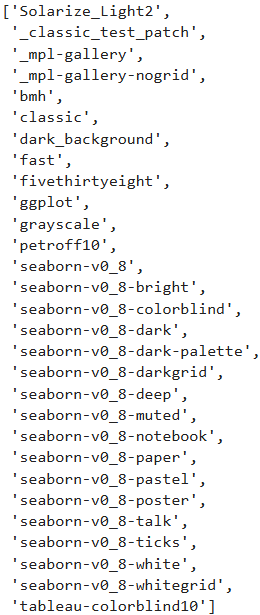
# 套用风格
x = np.linspace(-10,10)
y = np.sin(x)
plt.style.use('fast')
plt.plot(x, y)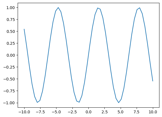
直方图
创建直方图
data = np.random.normal(0,20,1000)
bins = np.arange(-100,100,5)

fig, ax = plt.subplots()
ax.hist(data, bins=bins, alpha=0.7, color='blue', edgecolor='black', linewidth=1.2)

ax.set_xlabel('Value')
ax.set_ylabel('Frequency')
ax.set_title('Histogram')
ax.grid(axis='y', alpha=0.75)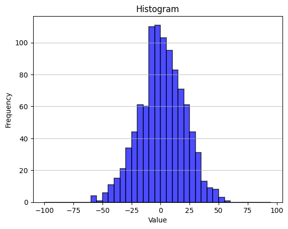
直方图堆叠
data1 = np.random.normal(0, 20, 1000)
data2 = np.random.normal(10, 30, 1000)
bins = np.arange(-100, 100, 5)

fig, ax = plt.subplots()
ax.hist([data1, data2],
        bins=bins,
        alpha=0.7,
        color=['green', 'orange'],
        edgecolor='black',
        linewidth=1.2,
        stacked=True)

ax.set_xlabel('Value')
ax.set_ylabel('Frequency')
ax.set_title('Stacked Histogram')
ax.grid(axis='y', alpha=0.75)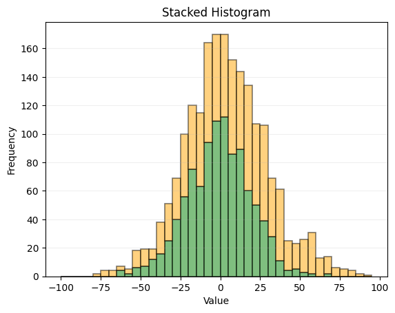
散点图
*多重数据散点图
# 定义第一个分布的均值向量 [0, 0]
mu_vec1 = np.array([0,0])
# 定义第一个分布的协方差矩阵,是一个2x2的单位矩阵乘以2
# 这意味着两个维度都是方差为2,且彼此不相关
cov_mat1 = np.array([[2,0],[0,2]])

# 生成100个来自第一个多元正态分布的样本点
x1_samples = np.random.multivariate_normal(mu_vec1, cov_mat1, 100)
# 生成100个来自第二个多元正态分布的样本点,均值比第一个分布大0.2(两个维度都+0.2), 协方差矩阵的对角线元素(方差)也增加0.2
x2_samples = np.random.multivariate_normal(mu_vec1+0.2, cov_mat1+0.2, 100)
# 生成100个来自第三个多元正态分布的样本点,均值比第一个分布大0.4(两个维度都+0.4), 协方差矩阵的对角线元素(方差)也增加0.4
x3_samples = np.random.multivariate_normal(mu_vec1+0.4, cov_mat1+0.4, 100)

fig, ax = plt.subplots(figsize=(8,6))
ax.scatter(x1_samples[:,0], x1_samples[:,1], marker='x',color='blue', alpha=0.6,label='x1')
ax.scatter(x2_samples[:,0], x2_samples[:,1], marker='o',color='red', alpha=0.6,label='x2')
ax.scatter(x3_samples[:,0], x3_samples[:,1], marker='^',color='green', alpha=0.6,label='x3')
ax.legend(loc='best')

plt.show()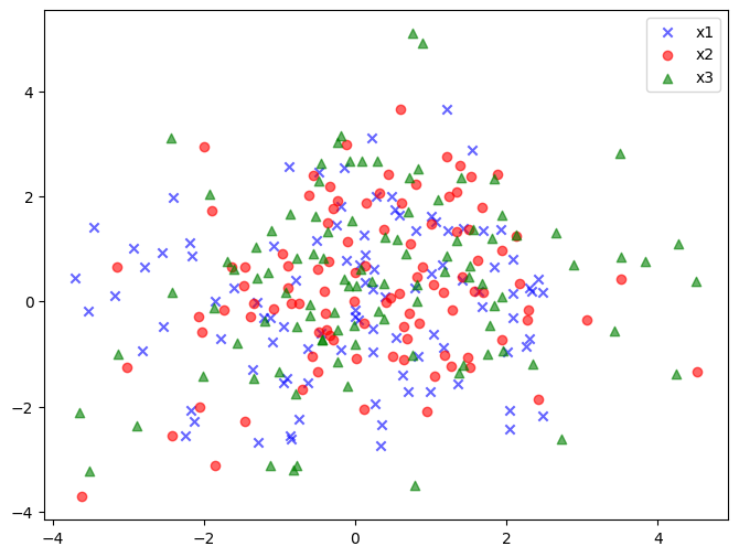
显示点的坐标
x_coords = [0.13, 0.22, 0.39, 0.59, 0.68, 0.74, 0.93]
y_coords = [0.75, 0.34, 0.44, 0.52, 0.80, 0.25, 0.55]

fig,ax = plt.subplots(figsize=(8,6))
ax.scatter(x_coords,y_coords,marker='s',s=50)

ax.set(xlim=(0,1), ylim=(0,1))

for x,y in zip(x_coords,y_coords):
    plt.annotate('(%s,%s)'%(x,y),
                  xy=(x,y),   # 数据坐标
                  textcoords='offset points',   # 指定文本位置(xytext)的坐标系类型,当前为相对于 xy 的像素偏移
                  xytext=(0,-15),   # 文本位置:向下偏移15像素
                  ha='center')  # 水平对齐方式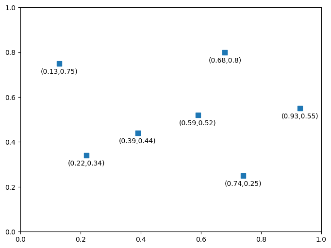
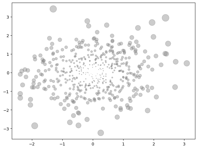
离中心点越远,点越大
# 定义均值向量 [0, 0]
mu_vec1 = np.array([0, 0])
# 定义协方差矩阵,单位矩阵表示x和y不相关,方差都为1
cov_mat1 = np.array([[1, 0], [0, 1]])

# 生成500个来自二维正态分布的样本点
X = np.random.multivariate_normal(mu_vec1, cov_mat1, 500)

fig,ax = plt.subplots(figsize=(8,6))

# 计算每个点的x²和y²值
R = X**2
# 计算每个点到原点的距离平方和(x² + y²)
R_sum = R.sum(axis=1)

ax.scatter(X[:,0], X[:,1], color='grey', marker='o', s=20*R_sum, alpha=0.4)